Project 3 : Conceptual & Physical Design
1.0 Storyboards
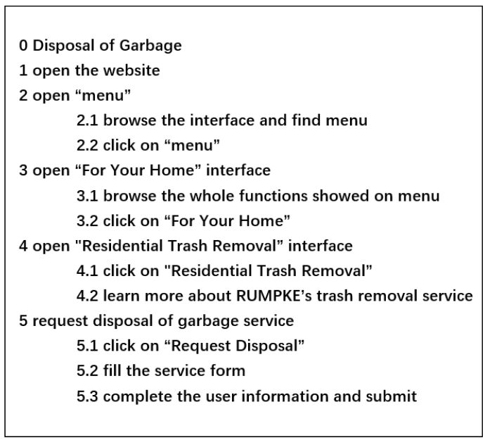
1.1 Task 1 - garbage disposal service

1.2 Task 2 - Schedule a visit tour

1.3 Task 3 - Pay the bills

2.0 Alternative Designs
2.1 Crazy 8 Design 1 – Liz Wong Wan Qi

2.2 Crazy 8 Design 2 – Hou Zhi Zheng
Task 1 disposal garbage

Task 2 visit tour

Task 3 payment

2.3 Crazy 8 Design 3 – Fu Wan Qian

2.4 Crazy 8 Design 4 – Su Yu

2.5 Vote of design
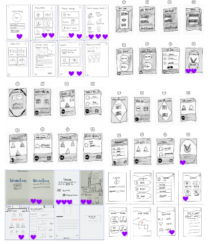
3.0 Wireframes
The general view:
the following link can open the figma page
https://www.figma.com/file/w9rcUIrbXgwhKqF2vv84YA/Untitled?type=design&node-id=0%3A1&mode=design&t=A7wxM5IaZthC3TYk-1

Part 1 - login:
In the login part, we use art lettering, the main body in black and interspersed green, to set up special commemorative digital pages. Thus, maintain the consistency of the design. The login pages contain the textbox of username and password with the login button, this has provided the clear instruction for user understanding. The home page provides the summary of the user on how many times that user had kept doing sustainable trash disposal. To proceed to the next page, you need to use the finger to slide up the screen.

Part 2 - menu:
After clicking on the menu button on the main function page, the interface will turn to the whole menu. In this part, we set up two levels of headings, with the big one on the left, always maintained. Using the icon design that is easy to understand, at the same time, it adds some fashion for the UI design. Clicking on a different big heading will bring up the sub service (page 2) of the application which shows the price and the detail of the service provided, users can choose the service and view the info based on their preference. The alert box will show out if some of the info or content that doesn’t complete, user will need to complete the info by clicking the go button to proceed the update info.
In project 2, the RUMPKE website sets so many subdirectories for the same function in many different classifications, making it harder to find the goal task and users are easier to get a little confused. To avoid the logical redundancy demonstrated in project 2, we choose to only have a big button - “all services' ' , and have only two hierarchical heading and each first heading has an icon.

Part 3 - personal information and payment:
In task 3, project 2, the RUMPKE website just throws stacks of processes whatever the way, how they arrange, as long as it finally reaches the goal of users. Therefore, after optimising the RUMPKE website design, we believe that on the mobile software side, we only need to set up a one-time operation of personal information binding. The operation of the subsequent user will not be based on filling in the information which provides the shortcut for the user to quickly proceed to the next step, and the service will be provided after the staff contact and inquire. It is the process of users actively seeking service, paying, and waiting for service. At the payment the user could permit reversal of actions, which is undo the payment if the user accidentally selects the wrong service. When the user finishes the payment the successful info box will pop up, to inform the user the payment is successfully paid.

4.0 Interaction Metaphors
4.1 Justification of the Design
We had designed the wireframe for the application name “WasteEase”. In this wireframe application, we implemented some of Shneiderman's golden rules, which are consistency, shortcuts, informative feedback, and permit reversal of actions.
For consistency, can be seen at the wireframe of login page, login page 1, homepage had consistency of design and button. In this app the main theme colour is green, black and white, to make the colour code maintain consistency. The design of the icon is also designed to look similar, designed to be obvious for users to know the function of the button. For the shortcuts, it has been shown when the user is doing the payment. The operation of the subsequent user will not be based on filling in the information which provides the shortcut for the user to quickly proceed to the next step, and the service will be provided after the staff contact and inquire. For the informative feedback shown at the “successful” page, when the user has finished the payment process, the application will give the feedback to the user. For the permit reversal of actions, we at the payment page, we have designed the back or reverse function button for the user. When users make an error in providing information during the installation process, they are allowed to go back to the previous step instead of being “punished” by having to start over. Since it is the application the user is using the phone to do the task, the phone itself provides the backing or reverse function for the user to reverse the page in the application.
As for gestalt principles, our UI of WasteEase fulfils some of the principles very well. ① Similarity: Each icon of WasteEase has a uniform size icon box to regulate the visual size balance of the icon. And all of the icons are using grey and a little red, while the whole application is using black and green. The icons of “all services” are highlighted with a special colour of green to inform the user of the difference between this feature and the other four features and to highlight this feature. ② Proximity: The proximity principle is applied to distinguish the segmentation between modules. First of all, We set different types of functions on different pages. Second, in the services page, the first level headings are distinguished by colour division and appropriate distance. At the same time, there is an appropriate distance between sub-services to ensure that each service will not be confused. ③ Good Continuation: On home page, the two arrows at the bottom are arranged up and down, creating a visual flow, and we perceive that sliding up opens the main function page. ④ Closure: In services page, the spacing between picture and text combinations is small, and our brains easily fill in this small module into a rectangle. Leaving a part of the whole (video picture, title, date) at the bottom lets us know that there is content below to continue browsing, and when the content shows a part, our eyes will naturally fill in the lost information and realise that there is still unfinished content below, so there will be the possibility of motivation to slide down.


Comments
Post a Comment